Author: R

  • Marcus Joint Account Opening a Design Delight

    Marcus Joint Account Opening a Design Delight

    Following our series highlighting user experience design failings, this post runs through a great example of a well thought through user journey. We’ll show you, and other financial organisations, that it is indeed possible to provide an effective joint account opening process without the need for paper or post.

    Context

    In Yorkshire Building Society Design Failings – part 2 we showed you one example of how some financial services providers ignore the digital user needs of joint account holders. Although these providers offer the latest mobile Apps and promote online access as their primary delivery channel they fail to deliver for some user types. Joint account holders are often classified as lower priority and revert to paper or physical channels resulting in lengthy delays.

    User authentication is often cited as the reason for the poor joint account opening UX. The primary account holder begins the online account opening process but the introduction of a secondary account holder results in complexities and the provider’s product owner decides to digitise that part later citing Minimum Viable Product or MVP! I guess the account opening project team get so focused on delivering primary use case scenarios they never get around to implementing the alternatives.

    However, joint account holders, together with an increasing aging population, are an important cohort of user types and should not be ignored. Although there may be fewer joint accounts, their average savings balances are often larger and so it makes sense for providers to consider their online needs.

    Doing it right

    Marcus, by Goldman Sachs, are of course a new entrant to UK consumer banking having launched here in 2018. So you may argue they don’t carry the legacy of traditional paper based processes that incumbent UK financial organisations have endured.

    On their website’s About us section Marcus highlights they combine over 150 years of Goldman Sachs’ financial expertise so you may think there’s a legacy in old ways. However, Marcus also mention this is combined with the innovation of a fin-tech and that they want to “help you manage your savings easily and effectively.” As I’ll show, Marcus have indeed managed to deliver a fully online joint account opening process.

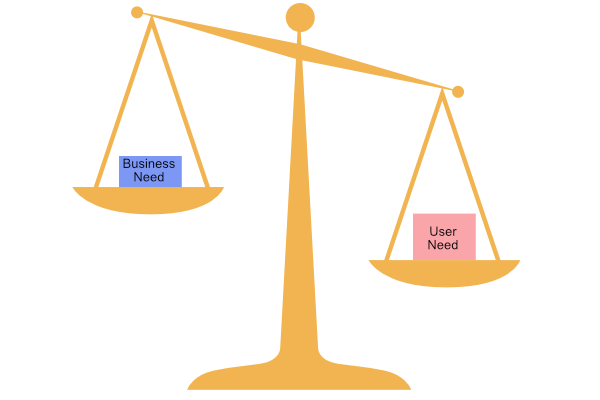
    So can this simple philosophy of putting the user’s need before that of the product team’s delivery be the reason for the success? It’s easy to dismiss corporate mission statements or perhaps simply ignore them when embarking on a new agile delivery. Here at Storycase, we’ve seen several digital transformation programmes with a plethora of mission objectives and hierarchies of target operating models were it’s too easy to loose sight of the hapless users.

    Driven by user needs

    In a joint account opening process there are two primary users. And that’s the problem for an online delivery channel in which there’s usually only one authenticated user. How can a second user be part of the journey when they don’t have a user account and are not logged in? Let’s just revert to paper, right? No. For Marcus and other enlightened providers paper is not an option as it does not align with the corporate mission and certainly does not meet the user’s need.

    Let’s look at how Marcus solves this. When you chose to apply for a joint account. You and your joint applicant will both need your own email address, because this is what you’ll use to log into your account. Both need to be present during the application as you’ll each have your own part to complete. You will be taken through the application first, then the other.
    You have to successfully complete your part before they can agree to open an account for you.

    Simple and effective. Of course, each applicant has to answer questions to ensure Marcus can identify the individual and pass the AML regulations that apply. And as a joint account holder, some of your personal information may be visible to the other joint account holder. But this should be reasonable as it’s a joint account!

    Modelling this journey with swim lanes demonstrates how the first applicant’s online session is used to pass from one applicant to another. The second applicant doesn’t need to login on their mobile or laptop, they simply pass control between each other using one device.

    Once the joint account application has passed verification and email is sent to each applicant to set up their online account. This way each applicant can choose their personal security credentials. Overall a smooth user experience which enables immediate account opening for both applicants. I should point out that each applicant must pass an online verification process and this will inevitably restrict certain people with insufficient criteria.

    UX design features

    The design team at Marcus have also made it smoother for applicants as they step through the data entry screens. Here are some examples.

    Dates

    Notice the expected date format is shown in the heading along with the hint text that pre fills the date. As you enter a character the hint is overwritten and separators appear automatically. If you make a mistake and backspace the hint reappears. This makes it super easy to use and avoid mistakes.

    As you expect, if you move away from an incomplete entry the data issue is highlighted:

    Marcus has followed an industry standard and used a red colour to draw attention to errors albeit the only data entry in error above is not actually red! Accessibility has also been considered with an exclamation icon and a textual error description for screen readers.

  • Yorkshire Building Society Design Failings – part 2

    Yorkshire Building Society Design Failings – part 2

    YBS screen showing session expired and data lost.
    YBS Session Expired – Data Lost

    Here at Storycase we’ve been involved in digital transformation programmes for both the private and public sector. Working with several of industry’s best architects and designers we understand what’s needed to deliver a service that meets the customer’s needs without costing the earth.

    With this lens we’re posting a series of articles to highlight failings we’ve found while using digital services. The intention is to name and shame – not maliciously but to put pressure on organisations to change the way they operate – and to deliver services that work.

    As bank and building society branches close we’ve come to rely on online services and mobile apps for our daily financial transactions. When these do not work as expected we justifiably get annoyed and the stress levels in our daily lives are raised. So what went wrong at YBS when trying to open a joint account and what lessons can we learn?

    Yorkshire Building Society – YBS Joint Account Opening Problems

    As mentioned in our previous post Yorkshire Building Society Design Failings – with increasing inflation rate here in the UK, like many customers with some cash savings we need to open a new YBS account to get a better interest rate. YBS fail to pass on bank base rate increases to existing savers while immediately hiking mortgage rates. Building societies create new account variants that pay a higher interest and fail to pass on rate hikes on older accounts penalising existing customers who fail to act.

    So after less than a year of opening an account we must apply for a new account to chase top rates. It sounds easy – just apply online today! No it’s not that easy at all and here’s why.

    The use case we need is to open a joint account and that’s not been considered a minimum viable product by YBS. While the online form does indeed provide a joint account option, selecting it takes the user down a rabbit hole.

    The form blindly asks for the full details of the joint account holder including a password but does not explain why. And entering all these superfluous details takes time that’s not been allowed so the online session can time out when the customer clicks submit.

    Adding a simple question – Does the joint account holder already have an online account? and if so entry of a username would avoid confusion. But no, the first account holder – they must have an online account in order to apply – is forced to type in the joint holder’s full name, phone numbers, email addresses and passwords that are all unnecessary and so infringe GDPR.

    Bad service design

    Of course the simplest way for existing joint account holders to open a new variant of an existing account eg from a Saver Plus Issue 12 to Saver Plus Issue 13 is to offer an upgrade on the existing account. This enables all account holder to be pre-filled but would be too easy and defeats the real object in YBS creating the new issue in the first place.

    Faced with YBS’s joint account opening form the customer has two options. Neither are good. The first option is to enter the second account holders details including passwords to match the online account that already exists. The second is to give up with opening a joint account and apply to add a second account holder later – which can only be done via post.

    If the second account holder does not have an online account the current form makes more sense but the password should only be set up by the second user at first login to avoid security issues.

    Adding a second account holder is not an online option even for an online only savings account so a paper form must be posted out and returned. With severe postal delays due to Royal Mail strikes and staff shortages here in the UK customers want to avoid post.

    Both journeys will time out if the user does not enter all the information within an unspecified time period or the session will timeout without warning. Clearly no user research or UX has shaped these journeys – I wonder why?

    Clearly it is not in YBS’s financial interest to improve the account opening journey for existing savers – it’s why they created the new account variant in the first place. We complained about the joint account opening experience when it happened a year ago and nothing’s been done. The user journey is still broken.

    Can it get any worse?

    Well, yes it can. After calling YBS customer services and being advised to clear cookies or try another browser and try again (we did neither) we persisted with the joint account user journey.

    Initially it looked successful – the account was opened with an email to both account holders. But the joint account was not visible to the second account holder despite the registration email stating it would be activated overnight.

    It took a further phone call to learn that YBS systems can take up to ten days to merge details and a temporary customer number would be posted out in the meantime. No mention of this online or in the email. Again, the user journey has not been considered.

    Design Failing Summary

    • Account opening form times out without warning – all data entered is lost and customer has to restart the journey.
    • Joint account holder credentials – first applicant forced to enter second account holder’s password
    • No option to use an existing joint account details to open a new account – this would avoid needless data entry.

    Come on YBS – fix your poor online service design or better still, stop the bad practice of spawning new account variants to penalise existing savers.

  • Yorkshire Building Society Design Failings

    Yorkshire Building Society Design Failings

    Here at Storycase we’ve been involved in digital transformation programmes for both the private and public sector. Working with several of industry’s best architects and designers we understand what’s needed to deliver a service that meets the customer’s needs without costing the earth.

    With this lens we’re posting a series of articles to highlight failings we’ve found while using digital services. The intention is to name and shame – not maliciously but to put pressure on organisations to change the way they operate – and to deliver services that work.

    Yorkshire Building Society – YBS Internal Transfer Problems

    As bank and building society branches close we’ve come to rely on apps for our daily financial transactions. When apps do not work as expected we justifiably get annoyed and the stress levels in our daily lives are raised. So what went wrong at YBS and their app?

    With increasing inflation rate here in the UK, like many customers with some cash savings we need to move money between accounts and providers seeking best interest rates. Larger banks and some building societies notoriously delay or fail to pass on bank base rate increases to savers while immediately hiking mortgage rates. Building societies create new account variants that pay higher interest and fail to pass on rate hikes on older accounts penalising existing customers who fail to act.

    Profit’s lie in the difference between deposits they receive from customers and the money providers lend so it’s no surprise that their savings accounts and business processes are designed to maximise profits.

    Customers need to open new accounts chasing the best rates and move funds from one account to another. So there’s an incentive for providers to make it difficult to do this and let fiscal drag increase revenue.

    My use case with YBS was to simply transfer funds from a savings account to another savings provider. We may well close the accounts if the issues highlighted are not addressed but that’s another story.

    Step 1 – transfer between internal accounts

    Each new account needs a separate third-party payee set up if you want to transfer funds out. This involves managing payees and entering the external account name and details but needs verifying with a small amount before sending larger sums so we’d not done this on the new account. As we had already set up the correct payee for an older account, where the rates had plummeted, we needed to do an internal transfer between accounts.

    When the YBS app starts up it shows the balance on each account so it’s easy to see which account has the funds that need moving.

    I begin by using the app to transfer funds internally from account A to account B. Using Transfers this is easy as the internal accounts show up when selecting the destination.

    Step 2 – return to view account balances

    On confirmation the app returns to the home screen and the balance for account A has decreased as expected but the balance for account B did not increase. When I click to view account B details the transfer transaction is not shown. Where has the money gone?

    So I try closing the app and login again – I’m thinking maybe it’s poor design and a restart will refresh the account details. Still the home screen account balances don’t reflect the transfer between accounts – the money I transferred appears to have vanished. Clicking into account B the credit transaction does now show along with the revised account balance but it’s different to the balance on the home screen – it’s very confusing. So there is a data caching issue – I had to exit the app for it to refresh the transaction list – but why did the main account balance screen still fail to show the correct values?

    Step 3 – attempt transfer out

    So next I try to make the payment from account B to the external account that’s already set up and verified. I enter the amount and click confirm. I get an error message – There are insufficient funds in the account to make the payment!

    Ouch. So I transfer funds internally and I can’t access the money I’ve just transferred. That’s not a good customer experience. I blocked – is it deliberate?

    When apps or online journeys fail it’s often due to ‘security’ measures that providers have hastily put in place in response to scams and online fraud which has taken over from the bygone bank raid. In my case I don’t suspect it’s a deliberate act by YBS to stop me making the transfer as I see the account balances are incorrect. But I’m wondering why such a common journey has not been fully tested by YBS before releasing the app – after all they’ve had three years in which to get it right.

    Step 4 – call YBS customer services

    I call the support number and wait in a queue listening to distorted music and a voice telling me how YBS are very busy at the moment and it’s faster to carry out things online. I wait patently.

    After ten minutes a real human answers and I explain the problem. They advise me to logout and wait 10 minutes. I explain I’ve done this while I’ve been waiting to speak to someone and am still seeing the message about insufficient funds. Well you will just have to wait longer they advise me again. I ask how long and am told as YBS is a building society their systems don’t work like banks and some accounts can take time for balances to show.

    This raises an eyebrow or two and I ask if they know this why they don’t include a warning in the app to avoid customers panicking and having to call. I ask if they can see the transfer I’ve just made from their system to reassure me. They can and so I ask if they can make the payment instead as we’re set up for telephone banking. They do so successfully with no need to wait. I then ask for a compliant to be logged detailing the scenario.

    Why should the customer be blocked from making a transfer when the funds are clearly present and the transfer can be made using an internal system?

    What really annoyed me about the whole experience with YBS is the attitude to their customers. They know their systems don’t work and have a story to feed customers that obfuscates the truth. There’s no reason for a building society account to behave differently from a bank when moving monies between internal accounts. Clearly external transfers make suffer different constraints but this should not be used as an excuse for poor system design internally.

    There’s no incentive for YBS to improve this experience because it’s literately in their interest to make it hard for customers to access money and move to better accounts.

    To add insult to injury the reason we installed the YBS app was in response to a YBS Money Guide email to highlight the app’s benefits:

    This month the YBS Savings app turns 3! Since we launched it in 2020, the app has continued to grow and develop. We now have over 300,000 registered users who continue to use it, and we are constantly looking to develop and add new features. Making it even easier to access your savings! If you haven’t already checked out our app, look at our guide for getting started.

    YBS Money Guide email

    Easier to access your savings? This means there’s over 300,000 customers that have or will find they can’t make the external payment they need if they follow this user journey. And they will end up calling the support number creating the high call volume. It’s a vicious circle where the customer ends up suffering due to incompetent system design.

    Lessons learned

    I don’t know what architecture YBS use but clearly there are several layers between the master system of record and the cached views surfaced through app, web and customer services deliver channels. I’ve represented an example of how this could occur below.

    System architecture showing the account balance in each layer

    Each layer may well cache the account balance to take the load off the master database and this can lead to the confusing state I experienced. Poor system design appears to have omitted to refresh the cached values after an internal account transfer. So the new account balance is not available for validation when making another transfer. Login out or restarting the app refreshes some cached balances but not all indicating the server side caches could be out of date.

    If I was writing out a ServiceNow ticket to describe the problems I’d mention the discrepancies between what the customer sees and what actually exists in the system of record. The balance should be consistent.

    User needs

    So what are the user needs and how have YBS failed to meet them?

    Here’s a set of user stories that try to capture what the customer wants followed by the business. We’ll let you the reader decide which is right.

    As an online customer
    I want my account balances to reflect my account transactions immediately
    So that I have confidence the actions I perform are obeyed correctly
    So that I don't worry that money has been stolen from my account
    So that I can carry out further actions with my money
    Given a customer has two immediate access savings accounts A and B
    And a transfer amount M is within the limits on the accounts
    When a transfer is made from account A to account B for amount M
    Then the balance for account A is debited by M
    And the balance for account B is credited by M
    Given a customer has transferred amount M from account A to account B successfully
    When a further transfer payment is requested from account B
    Then the current balance is used for account funds validation and not a cached value
    As a financial savings provider
    I want to delay presenting account balances to customers when they make transactions
    So that I can earn maximum interest from customers deposits 


    We hope we’re wrong and YBS have not deliberately designed funds transfer user journeys to cause friction and stress to its customers. But we’ve experienced similar behaviour from other financial providers that disregard user experience which makes us skeptical of ethical product management. Or maybe it’s the minimum viable product syndrome that plagues some poorly managed agile delivery programmes.

    Postscript

    YBS did respond to our complaint and upheld it, offering compensation for the time wasted. This was a welcome gesture but we did emphasis the only way to resolve this issue is to fix the underlying stale data cache or whatever reason YBS have for implementing this defective system behaviour.

  • NS&I How did service design go so wrong?

    NS&I How did service design go so wrong?

    NS&I Call Us screen with distraught emoji

    Here in the UK we have National Savings and Investments branded as NS&I which provide popular savings products to the public. NS&I raise revenue for the UK Government and in 2020 delivered £11.6 billion of Net Financing.

    So you would think customer service is top on the director’s agenda to ensure smooth running and secure the income stream from its 25m customers. We’re just one of the customers that have become disillusioned with service and if TrustPilot’s NS&I reviews are representative we’re not alone.

    What’s gone wrong at NS&I?

    Simply, it’s very difficult to speak to an NS&I service advisor anymore. Previously customers picked up the phone or walked into post office to buy Premium Bonds, cash ISAs and Index Linked savings products. As business moved online NS&I moved more of their account opening and management online via their website.

    Poorly designed UX

    Like many organisations that have built businesses using efficient call centres, NS&I decided automation is the way forward. When you try to call NS&I now you are greeted with a voice from a virtual assistant that sounds like a real person. Unfortunately they don’t say they are virtual so the unsuspecting customer may be lead down a series of rabbit holes as they think they are speaking to a human.

    Of course generation Z would likely get they are talking with a virtual assistant immediately as they’d seen the website – but granny or grandpa or generation X may take a little longer to twig. When you do manage to convince the bot they are not up to the task and you need to speak to a real human it all goes wrong. You are told they are experiencing a very high call volume and that the wait time is over 60 minutes. Yes, you heard right, not sixteen, sixty. Do you have over an hour to waste?

    Who ever signed off the IVR contract must have been crazy. We can imagine the meeting. “Okay, so with this new IVR we just spent zillions on we can reduce the call centre staff FTE count by 90% right? And we can do that before the end of Q2 just as we roll out the MVP right? So every one agrees, right.

    Wrong. They failed to think through the service design and volumetrics for the key user journeys. And I bet they failed to consider non-functional requirements, security risk assessment and so on. Here’s why.

    Simple fact – over 25m customers are rich pickings for fraudsters. Not all customers will have or want to use online services no matter how much you want them to. NS&I’s loyal customers got used to picking up the phone and talking to helpful call centre staff. When existing customers call they are told how many of their needs can be handled much faster by visiting the website.

    With call wait times over an hour there’s clearly too few staff to service customers. So why do customers call? In our case we’d tried to register for online or phone service and got an error message about a temporary password that had expired and to call the NS&I help desk.

    So you can see the chicken and egg user journey the fine service designers have set up at NS&I. For clarity, here are some scenarios.

    Scenarios

    Scenario A: Existing customer has no online account and calls NS&I and is persuaded to try online

    Customer calls and IVR tells them it’s much faster online. Customer goes online googles NS&I and follows signage to register. Customer starts registration entering account number and is told their temporary password has expired and to call the help desk. Customer is confused as they don’t remember ever having a temporary password. That’s because either someone else has entered their account number or they tried to register some years ago and gave up. Customer calls and IVR asks why they are calling. Customer says they are having trouble with a temporary password. IVR tells them it’s much faster to reset their password online using the forgotten password option. Customer goes online and clicks the forgotten password option. Customer enters their account number and surname and are shown an error telling them to call the technical help desk on the same number they had called earlier. Customer calls and IVR asks them why they called. Customer says they want the help desk and are told its much faster online. Customer getting angry says they want to speak to help desk IVR says okay, what do you want to speak about. Customer just says put me through to help desk and are told they will be put through. IVR tells them the call wait time is 60 minutes and plays musak.

    And so it goes. It’s woeful customer experience.

    Clearly the user journeys don’t fit the user’s needs. Forgotten passwords must be high on the probability and need an automated solution. The call centre queues are being flooded by requests that don’t need human intervention.

    The problem appears to be a dire inability to design user journeys that work. I bet they only considered true customers. How about this one?

    Scenario B: Fraudster steals letter from NS&I to customer about premium bond win.

    Fraudster steals post, opens letter and finds customer’s name, NS&I account number and details of their premium bond winnings and holder’s number. Lucky fraudster. Fraudster goes to NS&I website and clicks Register online. Fraudster enters account number, name and address from letter and is told to expect a temporary password in the post.

    We could go on but leave the scenario to play out in the reader’s imagination – no point in making it any easier for fraudsters.

    One key underlying problem here is how to authenticate customers given there’s no human interaction. NS&I are not alone in introducing two factor authentication as the traditional username and password is too insecure. NS&I still insist on giving customers a user number that few will every remember so have to write it down somewhere. Why not allow users to choose their own user ID such as a user name they can remember? Why not use OAuth? There are many better ways.

  • WFH Working from home

    WFH Working from home

    Covid-19 the great disruptor. Disruption.

    I’ve been used to working from home one or two days a week for several years. So when the coronavirus situation turned here in the UK and the need to WFH was announced I thought I and the team would be prepared.

    In reality, it was far from it. The first stand-up call failed. Too many people were working from home and the conference call infrastructure buckled. I spun up a free Zoom account. It took several hours for the confirmation email to percolate through the layers to my client O365 account, but next day the team could at least hear each other clearly.

    Several other team members registered accounts so it became difficult to know which one to use. If one failed we switched to another, but at least we could do team sit down stand-ups.

    Our usual team conference call package also bundled chat, along with IP telephony so we switched to MS Teams for chat. Only problem was the Teams client had not been rolled out so we had to use the web browser client. This consumed nearly 0.5Gb of memory and was dog slow on my ThinkPad. So I switched back to old chat and had two channels now to monitor.

    Teams would send an email when someone was trying to reach me. Another distraction. I could probably find the notification preference buried somewhere if I had time. Why not just email me I thought? I now had to monitor email to check Teams that took ages to load only to find someone has sent a morning greeting!

    We take communication for granted. We take time to learn how to use the new tools and use multiple tools effectively. It will improve.

    Team members, especially new to WFH shared tips. Simple things like taking a break, making sure your screen is the right height, having a comfortable chair, speaking to others rather than typing out messages all helped remind me of things I take for granted others may not.

    Childcare is obviously a real issue for some with work and family life intermingled. Soon toddlers appeared in the team meetings with the sudden dash to catch a wayward one from mischievous adventure. It all seemed funny but very serious as well. A tension rarely seen in WFH before.

    Exercise needs discipline without the mandated daily walk to the station and office commute. It’s all too easy to forget to exercise and healthy concentration soon suffered.

    Social groups and interaction – so much has been covered and virtual coffee mornings soon appeared in the calendar to replace the office kitchen banter that we take for granted.

    Social games – relieve stress. Online quizzes, endless funny videos consuming precious VPN bandwidth and even Eurovision style contests helped ease the strain of lockdown.

    After 8 weeks of lockdown, lunacy or more correctly well-being mindfulness raised in importance. It is hard to keep pretending this is normal. It’s not the new normal. But we will battle through.

    It’s interesting to think what could happen to cities if the great exodus to WFH remains the new normal after measures are slowly removed. All the office space that can only allow 50% or 25% occupancy. WeWork clusters that have an even tighter business case. The realisation that for some types of office work the need to be colocated was a myth and teams can be productive using remote working tools.

    Could there be an inversion with the move away from living in cities to the tranquility and greener countryside? Will house prices flip and London rates decrease as the supply exceeds the demand and offices become living accommodation? It’s interesting to ponder on the new economics of a post Covid-19 world. If there’s ever such a place.

    Not everyone can and will want to WFH so the shift is likely to be moderated. But could the high-street in towns and villages return to offer an escape from home office life? Local WeWork style venues like the coffee shops with wifi but allowing social distanced working space as an alternative to the home office. For local meet ups and a change of scene. Many more local social centres of enterprise rather than mass transit to mega city office spaces where hot desking had already removed the ownership of my personal space.

    The continued isolation of WFH will mean change, it’s a disruptor that we can’t ignore.

  • Working from home – Green energy off-grid

    Working from home – Green energy off-grid

    With Covid-19 lockdown measures in place I thought it a good time to review how environmentally friendly working from home could be.

    Removing the carbon from the daily commute into the London office had already seen a net gain. But how much more electricity are we using working from home?

    As it turns out power demand seems to have reduced from an average 30GW per day in pre lockdown 2019 to 25GW per day here in the UK in mid May 2020. Another carbon win.

    An energy meter showed my home office consumes between 50 and 140 watts running a couple of laptops – PC for client work and MacBook Pro for business – along with screens network routers and lighting. So it got me thinking can I run it on solar and go off-grid?

    The answer is yes. At an outlay of £180 for a couple of 100 watt mono-crystalline panels together with solar battery charger, a £100 12v car battery and a £200 pure sine wave inverter I have an uninterrupted green office power supply.

    Here’s how you can go green and off-grid too and probably for less outlay.

    If you don’t have solar panels already installed then you will need four main components. The PV solar panels that generate the low voltage DC, a solar charger to regulate the power from the panels, the battery to store the energy from the charger and provide power when the sun does not shine and finally the inverter to provide your standard AC mains supply.

    Solar panels – I chose a solar kit that bundled two 100 watt panels with mounting kit, the low voltage cables and 20A solar charger in one package. You should be able to find similar for under £200. I found a UK based supplier on eBay that delivered in a few days with lockdown measures just going into place. I used a couple of old pallets to mount the panels together at an angle of about 30 degrees. If you have more time and space the angle could be improved for a few percent increase in output. You could get away with a single 100 watt panel that would give around 5 amps charge allowing a 50 to 75 watt demand.

    Solar charger – a simple PWM (pulse width modulation) smart charger came bundled with the panels and kicks out a maximum of around 10 amps at 14.4v from the two panels. A quick calculation tells me I’m getting around 144 watts from the 200w panels which seems fair given conditions in the south east of England. It’s worth remembering like most specifications you are unlikely to get the actual rated power output so allow for this if you have higher demands.

    Battery – Let’s start by admitting the battery storage technology chosen was not ideal. I picked a replacement car battery from Halfords as one of the few places I could source a battery from in lockdown. Halfords delivery was very fast and UPS courier hazardous batteries to the door. Lead acid technology is old and heavy. And a car battery is not a deep cycle cell – it’s intended to supply high current, some 800A, for short time, 30 seconds to start a car. At 85A/hr capacity though it would power my office for about 10 hours and far longer if it’s being charged by the solar panels. Running it flat, after a dozen or so cycles, the capacity will be impacted. But I don’t intend to do that so it will be fine – just like it runs your car electrical system time after time, as long as I keep it topped up from solar it should not let me down. And when I’m finished I can swap out my old car’s battery that’s seeing little use in lockdown.

    If you have time it may well be worth investigating lithium batteries for storage. Tesla and others have invested millions in the technology and all laptops rely on lithium cells as their power to weight radio is hard to beat. The bundled charger automatically senses battery voltage and adapts the charging cycle to lithium so it’s an easy swap. I’m not keen on having very high power density lithium batteries inside my house due to risk of fire if a cell fails but I’m sure they will become more popular.

    Inverter – this gizmo turns the DC low voltage, high current from the battery into a mains voltage AC power we expect from the grid. There are many different types of inverter and a few traps for the unwary. Don’t be tempted to pick the cheaper inverter. It’s best to choose a pure sine wave type as that’s what your grid will supply. Pure sine waves can power inductive and capacitive loads which most appliances need including laptop chargers, monitor screens, and fans and fridges (for the beer and wine).

    I selected a 2500 watt pure sine wave inverter so in an emergency I could run an induction hob directly off-grid. Of course at that consumption rate my battery would not last long and I’d go overdrawn with only a 5 – 10% charging current from the solar source.

    A 500 watt inverter would be ample for a small home office set up and cost less than £100.

    Installation – You need about 1 square metre of solar panel to generate 200 watts at around 20% efficiency. I placed my two panels appropriately next to the greenhouse. Just for the lockdown. Shaded shelving inside the greenhouse houses the inverter above the battery that’s on the concrete floor. For safety, I installed an earth rod next to the glasshouse drain pipe so the inverter has a ground connection for our three pin plugs. It’s worth checking electrical regulations in your locale to make sure off-grid set up is safe and compliant.

    I have to run a 20m extension cable from glasshouse to home office which is not ideal but is the easiest way to switch over from mains to off-grid with one power socket.

    How does it work? – After over a month of testing and an above average amount of sunlight for April and early May I have to report it’s a welcome success! On average the battery receives around as much charge from the panels as I’m demanding from the office. It terms of a bank account – I’ve gone overdrawn just a couple of times when the cloud refused to let the sun shine through enough. And that was quickly replenished over the weekends when the home office was rarely in use.

    Some facts and figures

    Output power – Each panel is rated to generate 18V and 5.5A in ideal conditions. So far my rig has output a maximum of 10A at 14.4V in full sun. With some cloud that drops to less than 2A and full cloud below 1A at midday. So while it’s true these panels do generate power on a cloudy day you can only expect at best 10-20%.

    Heat – In full sun at midday the top panel recorded just over 50 deg C and the lower panel around 48 deg C. Ambient was around 25C. As mono-crystalline panels have a temperature coefficient of about -0.5%/ deg C this means a reduction of 12.5% so it’s worth ensuring you keep the panels well ventilated.

    Cooling – As an experiment I tried spaying both panels with fine water mist and waiting for the water to evaporate a couple of times. In just 5 minutes the temperature had reduced by 18-20C and output increased from 6.6A to 7.1A – not far off expected. Of course using water is not very green and the power needed to automatically spray the panels would likely cancel out the efficiency improvement but it’s worth thinking how heat recovery could improve efficiency for a large array.

    How green is your grid? – If you are based in the UK you may be surprised and there are some really useful sites that provide real-time data on power consumption demand and the production sources. For example National Grid: Live Status presents concise pie charts and today is reporting over 50% renewable energy with solar making up over 25% of demand – at 7.65GW makes my setup look insignificant but every little helps.

    Or for a gauge look try Gridwatch.co.uk which kindly provide the widgets below to give you an update every 5 minutes.

    Link to UK National Electricity Grid Status

    UK Grid Demand Solar Power and Wind Generation Now

  • User Experience Rants – MBNA

    User Experience Rants – MBNA

    Image showing MBNA logo with customer services number.

    Something as simple as txt message notifications should not be difficult. So when MBNA confusing me by sending new messages, different to the usual notifications, I called customer services. The experience and response I received made me more angry and worthy of this post.

    It started with a new txt message from MBNA rather than the usual anonymous 83838 number so I took notice. “We are due to receive a payment of £1234.56 from your bank. If there are no restrictions on MBNA card ending 1234 the payment value is available to spend”. (I’ve changed the numbers for obvious reason). This did not make sense. Why were they telling me they were due a payment? Had I forgotten to pay? I usually set up an online payment in advance so I double checked and yes, it had been made.

    So I called MBNA. After the frustration of being misunderstood by their automated voice response system I got through to customer services. Why have your txt notifications changed and what does it mean? I enquired. I was told MBNA are now part of a new bank and they are taking the opportunity to improve communication! Really? I ask the advisor what exactly “We are due to receive a payment from your bank…” meant. Well, we have received a payment from your bank and it’s due to be credited to your account. Okay, so why not say that I ask? It’s the same thing he says.

    How can “We are due to receive” and “We have received” be the same thing I say. The first is a call to action for me to respond as I think I’ve missed a payment. How many people start off thinking there’s been a problem and pay twice I wondered. The second is a confirmation that my payment has been received, I’m reassured no action needed. It’s simple clear language, surely?

    I raise it as a complaint. I’m put on hold. After ten minutes of calming music the call is terminated. I receive another helpful txt message. This one says” Sorry your call was cut off unexpectedly. To discuss and progress further, please contact us on 03456 062062 stating Resolve 11234567 cut off. I call the number. The AVR asks why I’m calling and I say Resolve 11234567 cut off. It then asks again why I’m calling. It seems the AVR does not understand. So I just say hash hash. And after a while I get to talk with customer services. A call centre once told me that pressing ## cancels you out of AVR systems and it seems to work. When I get to customer services they don’t know anything about my previous call so I repeat my sorry story.

    “Is there anything else I can help you with?” they ask. Well I noticed the other txt message I get says “A payment of £25 is due on your MBNA credit card ending 1234 by 04/03/19. For more information, check your latest statement or log in to mbna.co.uk.” Why is the amount always £25 and not the full amount needed to pay as listed on the statement? Well it’s the minimum payment you must make, he tells me. But why does it not say, A minimum payment is due on your account? Or A payment of £123.45 is due…? “Data protection”, I’m told “we can’t send you your actual balance as that’s not allowed under DPR”. Okay, so why do did you tell me how much you were due to receive from my bank then? I ask. Silence.

    Could it be that £25 is what MBNA want me to pay so that I incur the highest debt and pay the high credit charge for the longest period? Maybe I’m too cynical but that’s the main reason I can think of for the poor UX design and awful user experience. MBNA you should rethink how you treat your customers. I’m looking for a new card provider.

  • Zucks Bez and Tcents

    Zucks Bez and Tcents

    I had a dream. I’d just sold my latest little watercolour on Instagram. It went for $Z55.95, enough for Brian Eno’s Music for Installations I’d seen on Amazon for $B45.99. Ah, but wait a minute, Emanue_art has a copy of Installations for $Z38.50 on Instagram and saves me the 2% Cryptx charge for the exchange. Is this the brave new world or was it a nightmare?

    So what if Mark Zuckerberg ICOed the $Zuck, $Z for short. And Jeff Bezos launched the $Bez or $B and WeChat’s TenCent the ¥Tc? And these became the new cryptocurrencies of choice for trading on their platforms. It could make sense. Think about it for a minute. That shiny new Buy button on Instagram or that one click “Buy now” button on Amazon allows frictionless transactions that never touch your bank account or credit card. Don’t need to pay in dollars, pounds, yuan or yen – welcome to $Bez and $Zucks.

    You may be thinking, okay, so it wouldn’t work. I don’t trust cryptocurrencies and surely I’d still need my $ / £ / ¥? No, they are consigned to history. Why use a state controlled currency when what you really want to buy is priced far more keenly in your friendly social cryptocurrency? You trust Jeff and Mark and the other mega platforms that would jump on board, after all you deal with them every day. Out with the $Buck in with the $Zuck. Okay I’m in, how do I start?

    How could it work? Well it’s so easy. You just start by stocking up on $Zucks or $Bez or whatever platform’s currency you feel an affinity for. There are plenty of ways to get started. Take Instagram for example, you simply load up your account with $Zucks from old world currency before values plummet or you earn them directly on the platform. $Z1 costs $1.075 from Zuck but there are plenty of places where you can get a better deal. Just search for #zuckduck on Instagram and you will see who’s offering a better deal. You see it’s easy to move to $Zucks. Same over on Amazon, in fact Jeff may give you $B100 when you sign up for Prime++ (okay I’m just throwing it out there, he may not be feeling that generous). Mark could be thinking of a similar deal for you to remain on your Facebook account. Maybe a couple of $Zucks for each like for a minute, or maybe not.

    It’s mostly all there already. Back in 2017 Amazon registered domains AmazonEthereum.com, AmazonCryptocurrency.com, and AmazonCryptocurrencies.com suggesting they wanted to enter the market. Barclay’s internet analyst Ross Sandler mentions the idea of Facebook launching their own cryptocurrency Facebook coin and bring in nearly $20m revenue by 2021. Think about Amazon’s credit card or the new Apple card – supposing the base currency is a cryptocurrency. Maybe a $Job for Apple?

    Minting crypto currencies is easy, gaining trust has always been the difficulty, witness Bitcoin’s rollercoaster ride. Platforms like Amazon and Facebook have global reach and support encryption end-to-end. Sending money is a simple as sending messages. Trading likes for $Zucks appeals to our need for greed. I don’t mean that in a bad way. The endorphin kick we get from a like is similar to the feel of that crisp $100 note or that first pay packet. Yes, the data trust issues with Facebook and cryptocurrency volatility will be a factor in gaining trust, but there are so many advantages of a social currency we won’t look back for long.

    Still not convinced? it’s a win-win scenario for you and me. Here’s why. Suppose I want to buy some new roofing. I get a few quotes from local traders that come in between £4000 to £5000. Their prices all include tax of some sort. In the UK it’s VAT at 20%. Yes another 20% of your hard earned cash goes straight to the state, that’s £1000 on a £5000 item. In the US there are sales taxes and local taxes and I’m guessing US readers would be horrified at having to fork out an extra $20 on a $100 item but that’s what we suffer here in the UK and it’s higher in some other European countries. So you can probably see where I’m going with this. If I can buy my roofing from a trusted roofer on Instagram the price is not $5000 it’s only $Z4000 and I can pay for it by selling a few more watercolours (okay, I’m still dreaming and that may take a while).

    What about the tax man’s share you ask? Well they have to catch up with cryptocurrencies and in the old fashioned world what I’ve described could be made as barters that can’t easily be taxed. Whoopee. So what happens to the state? How are they funded. Well gov.uk needs to live up to its digital government proclamation and get with it. So will other governments because the world is going to trade in $As and $Bs and $Cs. What’s $A you ask? Well we can’t forget Alphabet that’s Google to you and me. They also have near global reach if you ignore China, which we can’t and I’ll come on to.

    Every Google search generates $ revenue for Alphabet, so say they have ICOed $Alphas or $A for short. (In time there could be dedicated currency symbols with strike throughs like €, ¥, for the winning crypto currencies but for now the $ symbol is at hand.) So those roofers I found on Google also advertise and I can see their quote already displayed in their details. I forgot to mention that AI works frictionlessly with cryptocurrencies as well, so just by talking about a new roof, Google Assistant could give me those quotes… I can pick one of the roofer’s offers for $A3200 that has an excellent rating and pay for them instead. But my $A account is not doing as well as $Z as I’m not selling as well on Google (can’t afford the Adwords) and my local guide likes have not earned enough. Do you start to see the picture?

    Each of the major platforms have their own cryptocurrency that provides frictionless transactions without the need for traditional money exchange across countries or the taxes that take a cut out of each one. From Google with $Alphas to Instagram and What’sApp with $Zucks. $A to $Z.

    Staying within a platform keeps costs to a minimum. There’s still a need for foreign exchange – I will want to swap my $Z for $A to pay the roofer if he’s offering a better deal. That’s where Cryptx come in (I made the name up so if there is already a company with that name offering a similar service I apologise now, if not trademark it quickly!) Of course each platform will offer their own exchange service and rates because that’s what they will do. Think about your bank and then imagine that is now one of the platforms. Instagram mortgage or loan or savings account? No problem. Amazon already offer credit cards so credit in crypto is a no-brainer. What happens to traditional high-street banks? What high-street I say. It’s a different landscape in the world of cyber currency platforms. Cyber-street, Cyber-city. More on that in another post.

    In China, Tencent’s interest in cryptocurrencies like Ripple and OST have been reported. Bloomberg published an article in February 2017 that China is developing its own cryptocurrency. Adding a cryptocurrency is arguably the easiest and the most difficult in China. Tencent’s platform already provides integrated banking, taxis, social networking, dating, eating, etc, etc. But in China the state has more control. It could be Huawei’s Ren Zhengfei that names the $Zhengfei or $任正非 and the ¥ fades or maybe not. Don’t understand enough about China to predict the outcome, but am sure cryptocurrencies will have winning advantages as platforms carve out a money supply economy all of their own.

    Frictionless contactless mobile payment has a certain ring to it. And we do need digital wallets to keep our crypto cash safe and accessible, so a handy mobile may be the way to go. Huawei or one of the other physical platform providers like Apple are obvious choices.

    Once we trust them, a switch to cryptocurrency for everyday use is compelling. Facebook workers paid in $Z rather than $ (along with the shares for the lucky). It would bring down the wage bill – keeping it all in the ‘family’. Say I earn $Z20,000 for some consultancy work I do for Facebook. No taxes for the company, no taxes for me unless I swap out of $Zucks for £ or $. And that’s the point, while I’m trading within the platform no-one else can see my transaction or get their hands on a piece of it. We just need the trust.

    So what is a social cryptocurrency worth? How do I know how to price my goods and services from $A to $Z and how do I know how much to pay? Don’t worry. Pricing in $Zucks will become as common as pricing in Bucks. It’s likely that crypto’s exchange rates will start off close to the nearest old-world currency so that in the US one dollar is worth one Zuck. The sheer size of the platforms and their control will stabilise values. After ICO things could get interesting. Just like government and monetary unions use interest rates to control their economies the cryptocurrency platforms can use interest rates to control exchange rates and their own economy. True disruption of the old-world state backed currencies and for some the nightmare.

    If this all sound a bit complicated think about it like this. Say you have earned $Z500 selling some advice on WhatsApp (yes whatsApp is part of Zuck’s economy). You don’t want to spend it right now but want to earn some interest. Zuck is offering 5% in the IG eazySave account so you open an account and deposit the $Z500. In a year you will have earned $Z25 enough for five cappuccinos. But Jeff pays 10% on his new PrimeSaverFix account with the interest rate guaranteed for a year! Do you see where you’ll be heading? Even if you pay the 2% Cyptex change to swap $Z to $B you will still have more cappuccinos for free a year on.

    By issuing a cryptocurrency, the platform owners can control their own interest rates independently – it’s their currency. True, in the old world the banks could offer different interest rates to attract customers but they were all pegged to the state’s currency and base rate and market forces that limited choice. I’ve not thought through all the implications of what flexibility this fiscal policy provision may bring the owners but I do know governments will be concerned if it’s out of their control.

    I can imagine a future where investment banking is disrupted too – and instead of $ / ¥ currency swaps there are $A / $Z swaps an so on. Again having one side of the trade inside the platform will be efficient so that’s where investment banking will be done.

    Could this be the future? What do you think? Back from the dream to reality, the current appetite for cryptocurrencies with the general public looks weak. We simply don’t trust their stability enough to invest seriously and use every day. Some early adopters have done well and this lead others to pile in. Security is a real concern and the platform’s data breaches don’t help. And governments can’t ignore loss of tax revenue if transactions switch to cryptocurrencies so they could ultimately change laws so the platforms collect the tax and they end up paying their fair share. Of course it’s yet to be determined what’s fair.

    I’ll run through some typical use cases for platform crypto in the next post.

  • Finding the real user need

    Finding the real user need

    On a recent assignment to transform a legacy application to cloud we came across a good example in finding the real user need. As with many IT migration projects this incident tracking application had a tight deadline and a set of assumptions about user needs.  ‘Lift and shift’ was the mantra and the idea of going out and talking to end users about their workflow requirements met with raised eyebrows.

    To be fair the incident reporting process was regulated and so well understood by end users and internal staff and accounted for a good 90% of the story backlog.  But there was one epic, folder management, that had a wrong smell. Some years ago as incident volume grew user’s had complained they could not find their incidents and they wanted a way to organise them like files in a folder. So users were given a folder management feature where they could name their own folders and move incidents in any taxonomy structure they liked.

    It was a popular feature with over two thirds of the user base having a named folder and many having dozens. User’s folders were private and internal staff did not know how they were being used just that users were grateful. Building out a new folder manager and migrating existing structure to the new cloud application would be possible but time-consuming. But what did users really need?

    As we had access to the folder metadata it was possible to look for patterns in the names used. Not surprisingly dates and names relating to incident types were the most popular along with user’s names and various ad-hoc names to organise. But why make users move incidents into dated folders when we could give them a dynamic filter in the cloud?

    There was already a story to filter incidents by reporting date and type so it was easy to extend and demonstrate the idea. Conceptually filtering things and placing things in folders achieve the same user goal albeit with a couple of caveats — user’s viewpoint and persistence. The preset year and type filters replaced the static date folder hierarchy and incident type hierarchies. No need for users to manually curate their things – a win for users and a win for the business no need for folder manager feature. But what about the ad-hoc names they used for folders?

    Given a way to create their own filter criteria as tags users could apply ad-hoc filters just the way they did using folders. Tagging would still need a new feature though. Initial discussion with the main users of folder manager approved the new approach. So much so that all representatives thought the new set of preset filters would be all they would ever need. Crucially they suggested a simple notification when first using the cloud application to highlight filters to the wider user community. A simple broadcast message feature was already in the backlog.

    As the retro for this project makes clear – remember to ask your users what they really need and beware of requirements disguised in a design. Files and folders were a wonderful metaphor in Windows but need not apply everywhere.

  • Discovery balance

    Discovery balance

    How to make discovery successful?

    I’ve found the best form of discovery is to reach a balance. Here’s some reasons why.

    Most of the recommendations for discovery phase out there focus on researching user needs to ensure you build a service users actually want. For example the GDS service manual describes identifying who your users are and mapping out their user journeys. Bringing on board user researchers and setting up 4 to six week discovery phase plans all revolve around identifying features and concluding with a minimum viable backlog of user needs.

    This makes sense. However, depending on who you class as users there’s usually a crucial area missing. The clue is the viable in the MVP – minimum viable product. How do you discover what’s viable? If during discovery all the users have been end users – consumers or customers of your services – then your backlog will be consumer feature heavy. In reality to decide what’s viable from a business service delivery perspective you need to include your business as uses along with legal representatives, shareholders, policyholders, etc.

    Imagine the scales of justice trying to balance end user needs against those of your business. That’s what I mean by reaching a balance. If you just consider user needs you may not have a business. Yes, there are many startups with venture capital funding that ignore business viability in the hope of acquiring a critical mass of users but ultimately someone will have to pay.

    Balancing user needs with business needs

    So for mature organisations another way to think about discovery is to ask do I have a viable business? Understanding the end user needs for a product or service is not enough unless you have unlimited funding, resources and can write your own laws. Legal, ethical, green constraints shape the viability.

    An example I met recently is a company called ClearScore. They identified a real user need to access credit scores freely. In the UK and elsewhere credit reference agencies collate consumer’s credit data and sell a credit reference service to businesses. When you apply for a mortgage, insurance policy or a mobile phone account your credit history is used by the business to determine the risk and whether you are approved. You can get your statutory report by paying £2 or sign up for a monthly subscription to view your credit report and credit score. Subscriptions cost typically £10 to £15 / month.

    ClearScore’s MVP relied on an easy sign-up for user journey with the promise of free access to their credit reports. The company could then target credit products at their users. The balance here is between easy of sign up to reach the user base and commission from the credit products. ClearScore use Equifax to provide their credit reference data as they don’t have their own.

    A key problem ClearScore and all the credit scoring companies have is how to identify the user is the person they claim to be. With Equifax’s security breach that released millions of US and UK consumer’s credit data, privacy and security is a big issue. The three main rating agencies either post out new account details to verify the user’s address on registration is the one they have on file or they use a credit card verification check.

    ClearScore decided to rely on a series of multiple choice questions to first identify a consumer’s account and then match it to credit history. This allowed an instant sign-up but at a cost of security. I know as my credit details were made available to a third party who went on to use the data fraudulently. The answers to identify a consumer’s account are generally available in the public domain – name, date of birth, etc. Answering correctly the multiple choice questions comes down to simple probability set at about 1 in 15,000 which seems high until you consider the millions of consumer accounts out there.

    So along with the business need to build user base to drive revenue from pitching credit products to consumers ClearScore needed to address the security needs along with the usual non-functional requirement suspects. NFRs can get pushed to one side to focus development efforts on building out the main user journeys. ClearScore are unlikely to be the only business that rely on such probabilities.

    Putting too much weight on user needs or ignoring critical business user needs leads to imbalance.